 First of all what I like. I like the colors. I don't mind that the front is yellow and back is blue. I like that the primary logo is front and center. I like the number font and the loof of the back.
 What bothers me are the vertical white stripes on the sleeves and collar and the grey ends of the sleeves. The Buffalo word mark on the front is unnecessary. The combination of the word mark, blue/yellow line and multicolored collar make the chest area of the jersey look crowded.
My biggest problem with the jersey design is the lack of hockey jersey stripes (horizontal waist and sleeve stripes). To me, a hockey jersey should ALWAYS have horizontal waist stripes.
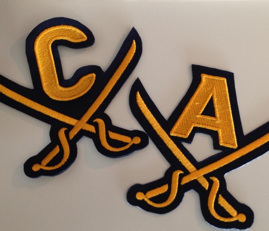
One question I have is what will the back of the jersey look like when there are two numbers on it? The Ott jersey doesn't look like it will have enough room. If the edges of the numbers break onto the yellow I don't think I'll like it. Same with the Captain and Alternate letters on the front. If they are over the blue/yellow border I think that will look awkward and messy. I don't see how they'll fit otherwise, especially now that the letters have crossed swords under them.
I'll hold final judgment until I see it on the ice. I doubt I'll ever hate it, but neither will I love it. I wasn't a huge fan of the 40th anniversary jerseys either.
For me the perfect Sabres jersey would be their current home and away with the primary logo on each side of the shoulder yoke. Want a third jersey? Wear the white Winter Classic jersey.